CARE-WALLET
CARE-WALLET
CARE-WALLET
Product Development
Product Development
UI/UX
Branding
Figma
Illustrator
Relieving the burden of care taking
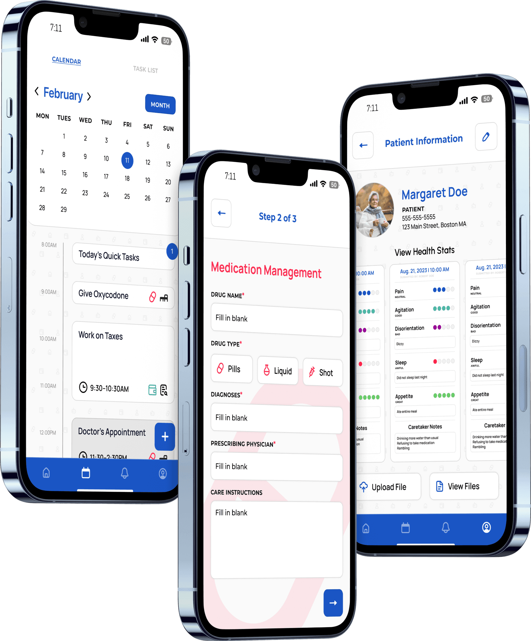
Care-Wallet is a platform dedicated to making the care taking experience more manageable. The app provides a medium for creating, tracking, and delegating tasks. Care-Wallet aids users in the already emotional process while emphasizing the importance of familial love and care.
Since Care-Wallet existed in the healthcare space and targeted users with geriatric loved ones, it was crucial for us prioritize accessibility, and simplicity when it came to our designs.
Care-Wallet was designed and developed for an external Client (Em-Tech Labs) by Northeastern Students. We were given guidelines, goals, and restrictions to follow but still made Care-Wallet our own.
Care-Wallet is a platform dedicated to making the care taking experience more manageable. The app provides a medium for creating, tracking, and delegating tasks. Care-Wallet aids users in the already emotional process while emphasizing the importance of familial love and care.
Since Care-Wallet existed in the healthcare space and targeted users with geriatric loved ones, it was crucial for us prioritize accessibility, and simplicity when it came to our designs.
Care-Wallet was designed and developed for an external Client (Em-Tech Labs) by Northeastern Students. We were given guidelines, goals, and restrictions to follow but still made Care-Wallet
our own.
Team
Team
Tristan Phan
Erin Furey
Grace Uecker
Allison Xu
Ruohan Li
Tristan Phan
Erin Furey
Grace Uecker
Allison Xu
Ruohan Li
UI/UX + Brand Designer
UI/UX +
Brand Designer
Role
Role
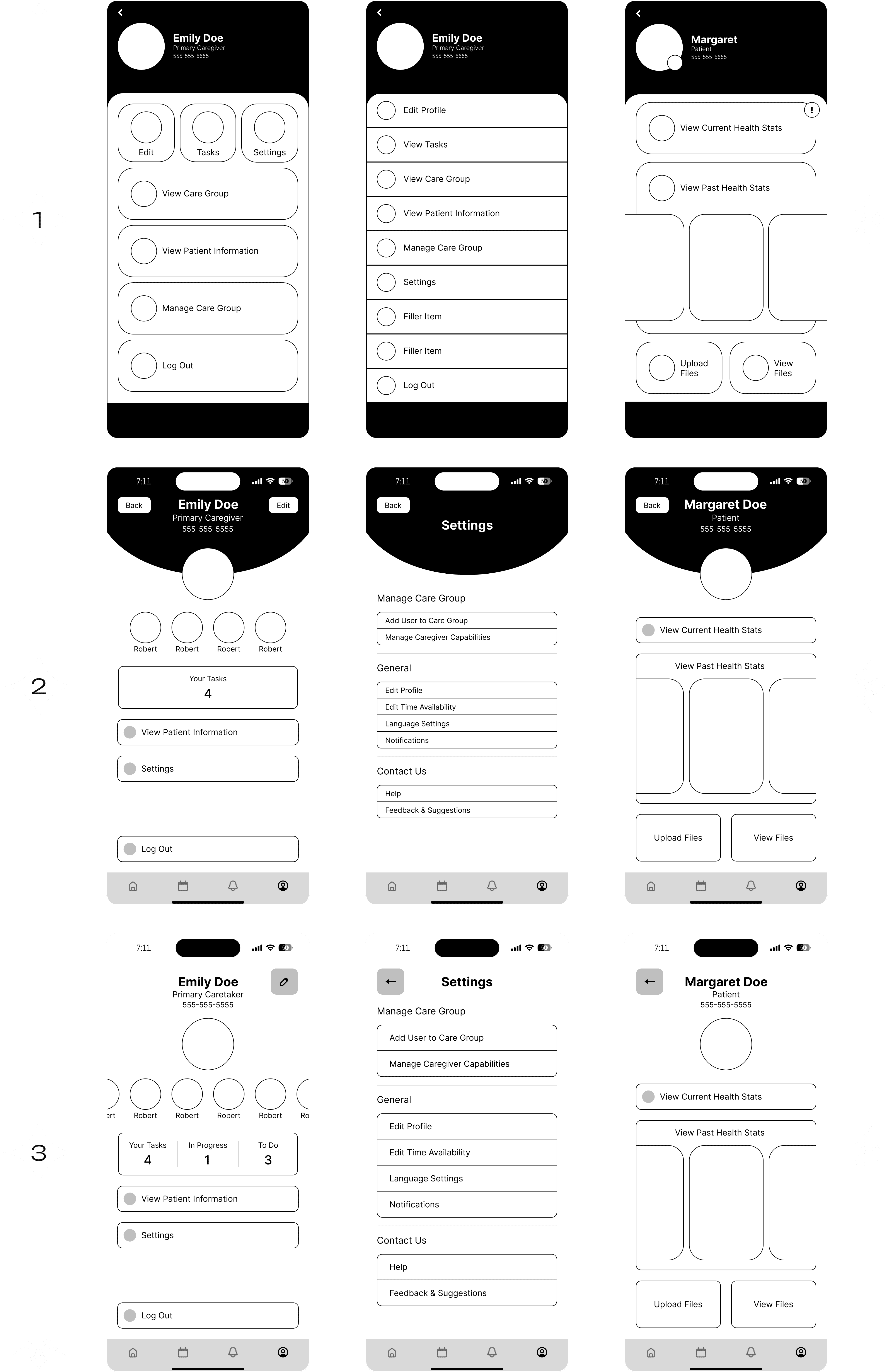
User flow for
Profile Screens

I learned a lot about the product development cycle while working on Care-Wallet. We started with user flows, mood boards, brand-scape research, and personas before beginning to iterate on lo-fi screens.
I learned a lot about the product development cycle while working on Care-Wallet. We started with user flows, mood boards, brand-scape research, and personas before beginning to iterate on lo-fi screens.
User Flow for Profile Screens
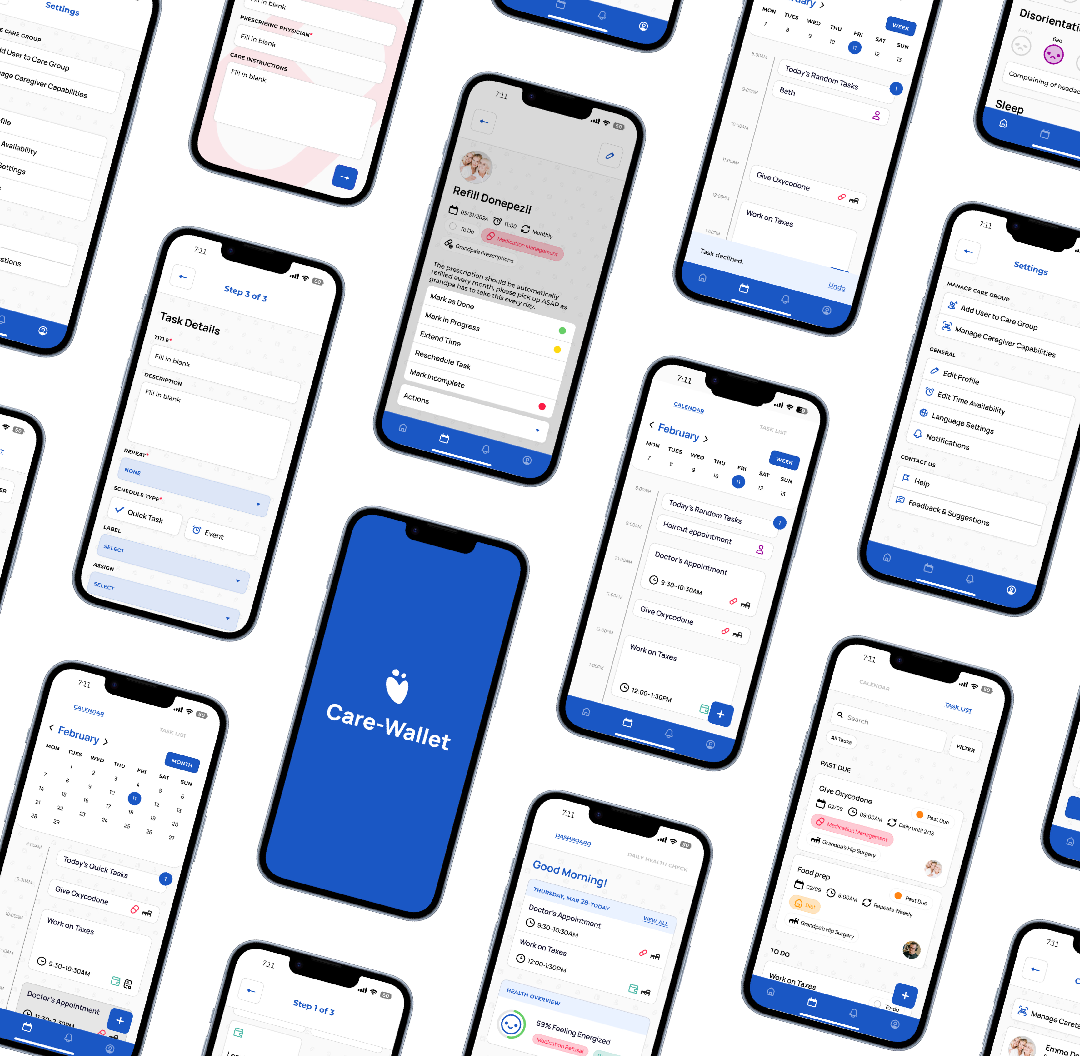
Iterations
This last iteration of Lo-Fis aimed to standardize my work with the other designers, utilizing components and visual styles agreed upon by the team.
This last iteration of Lo-Fis aimed to standardize my work with the other designers, utilizing components and visual styles agreed upon by the team.
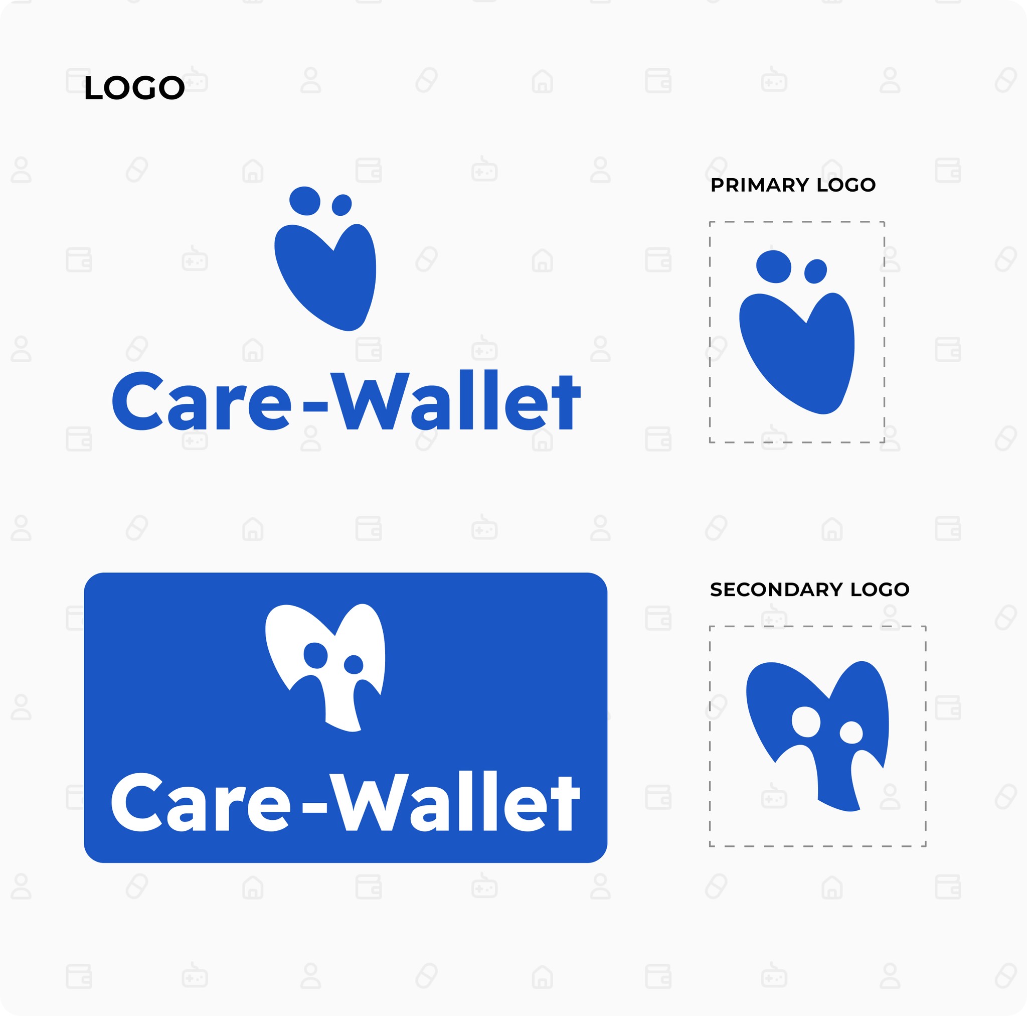
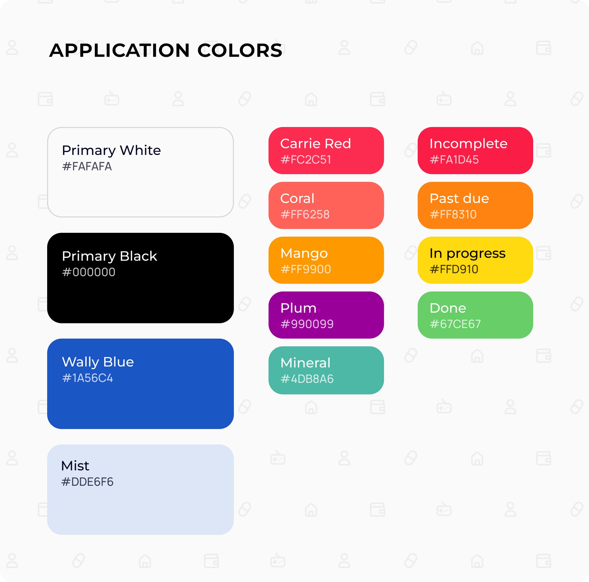
Branding
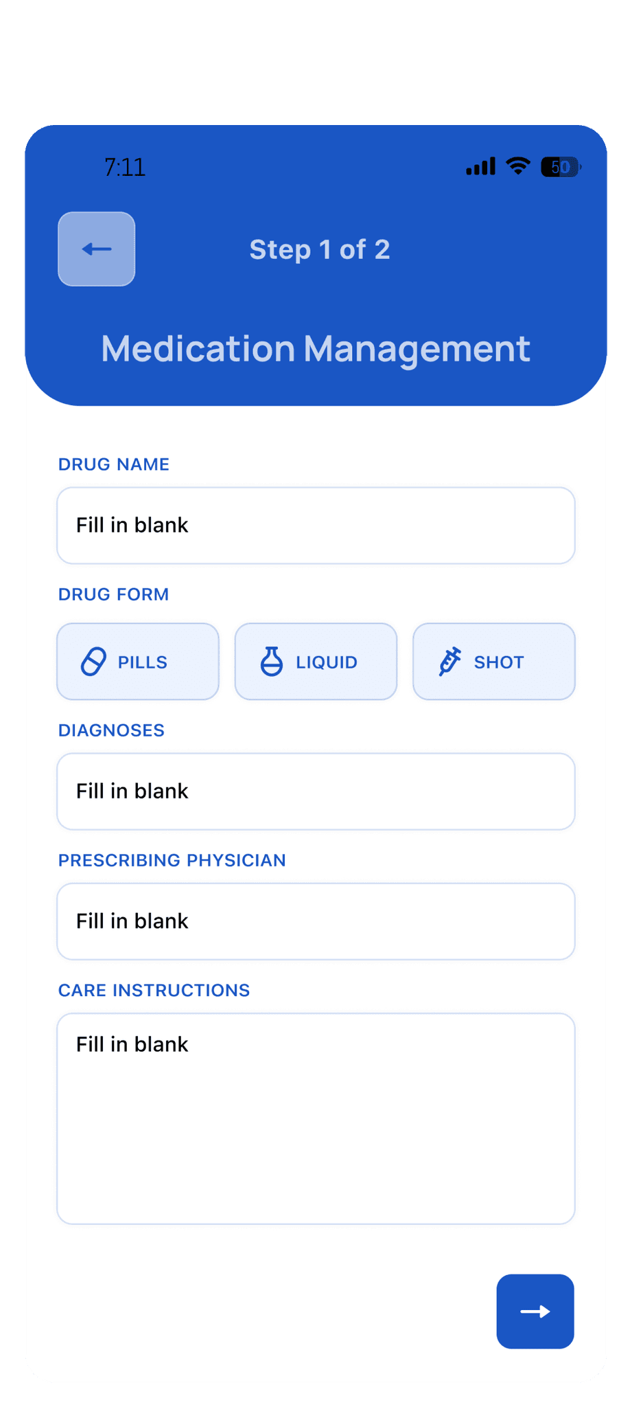
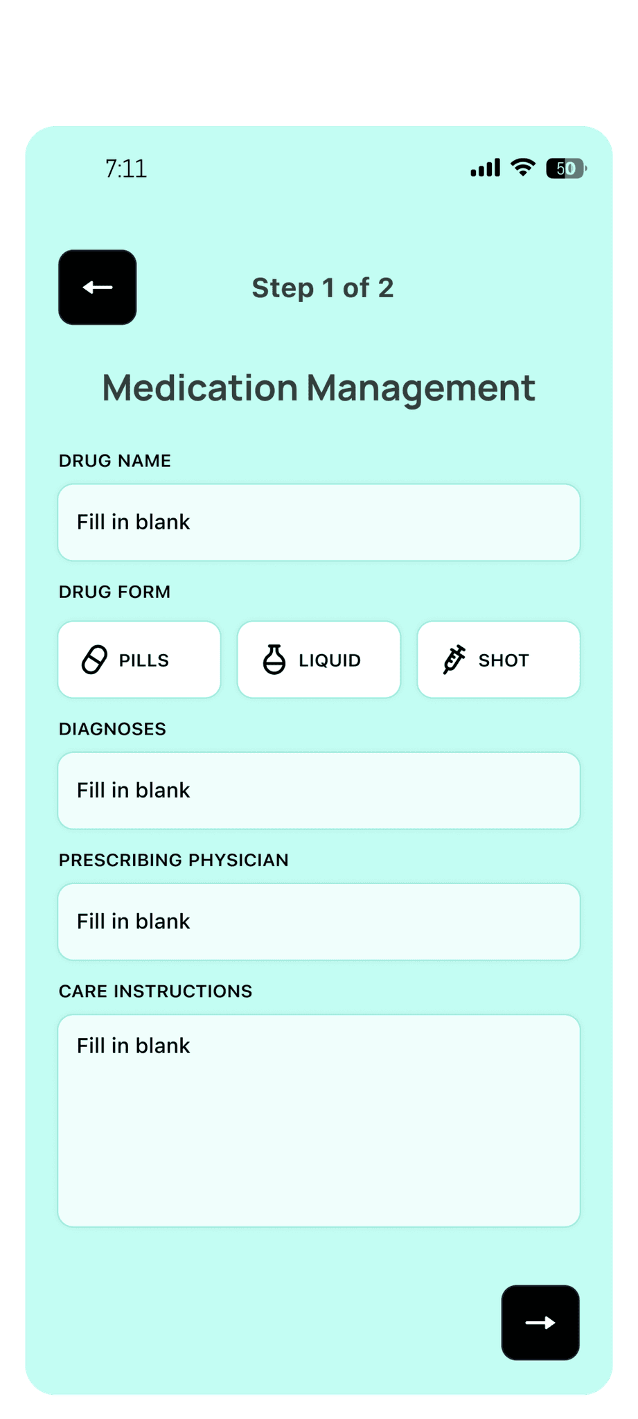
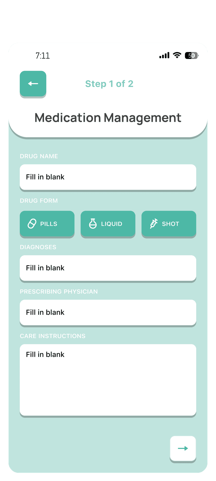
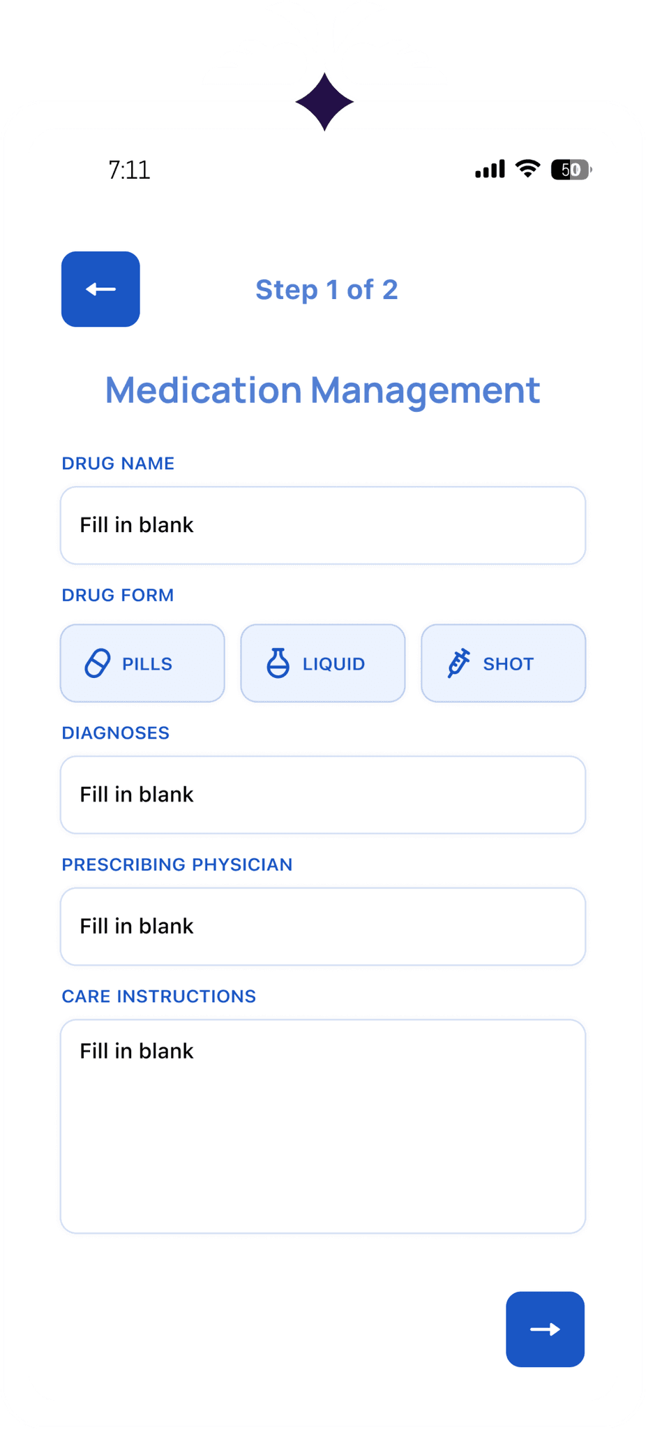
Before creating Hi-Fi iterations of our screens, the team came up with a series of different visual styles and color palettes. For the visual style, we decided on option #4, as the color application was sparse and intentional. Something too vibrant and dynamic wasn't fitting for an information-heavy healthcare app.
Before creating Hi-Fi iterations of our screens, the team came up with a series of different visual styles and color palettes. For the visual style, we decided on option #4, as the color application was sparse and intentional. Something too vibrant and dynamic wasn't fitting for an information-heavy healthcare app.
Before creating Hi-Fi iterations of our screens, the team came up with a series of different visual styles and color palettes. For the visual style, we decided on option #4, as the color application was sparse and intentional. Something too vibrant and dynamic wasn't fitting for an information-heavy healthcare app.
I learned a lot about the product development cycle while working on Care-Wallet. We started with user flows, mood boards, brand-scape research, and personas before beginning to iterate on lo-fi screens.
This last iteration of Lo-Fis aimed to standardize my work with the other designers, utilizing components and visual styles agreed upon by the team.
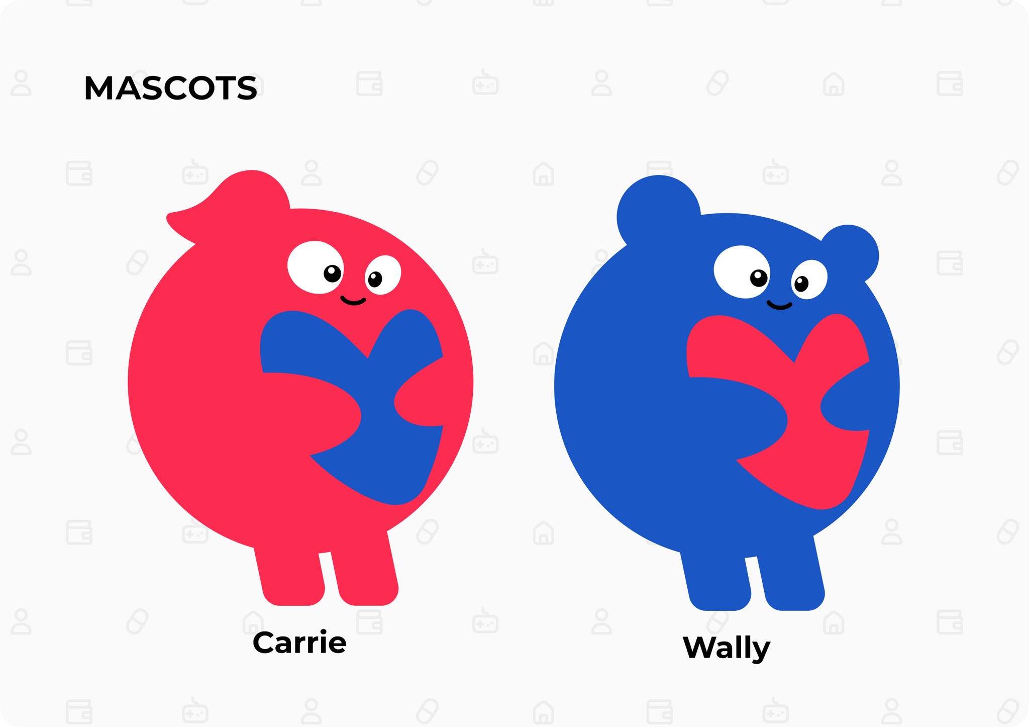
These are the two mascots I made for
Care-Wallet :)
These are the two mascots I made for
Care-Wallet :)
These are the two mascots I made for
Care-Wallet :)
Hi-Fi Screens


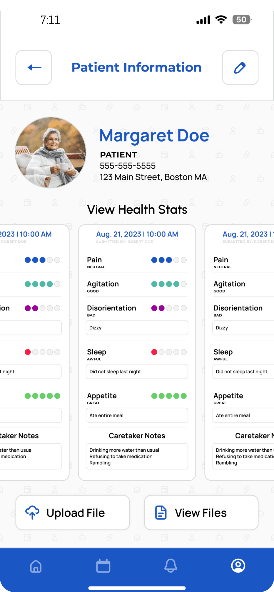

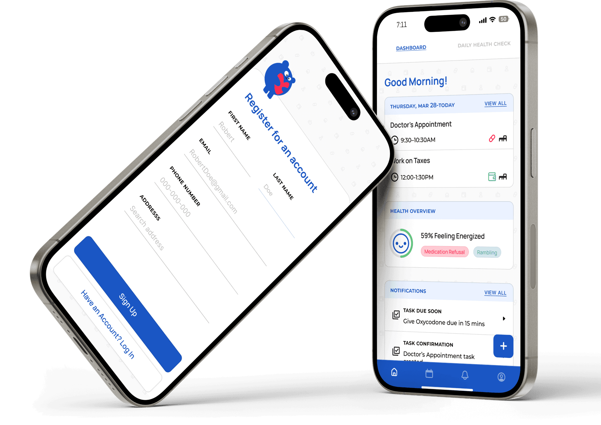
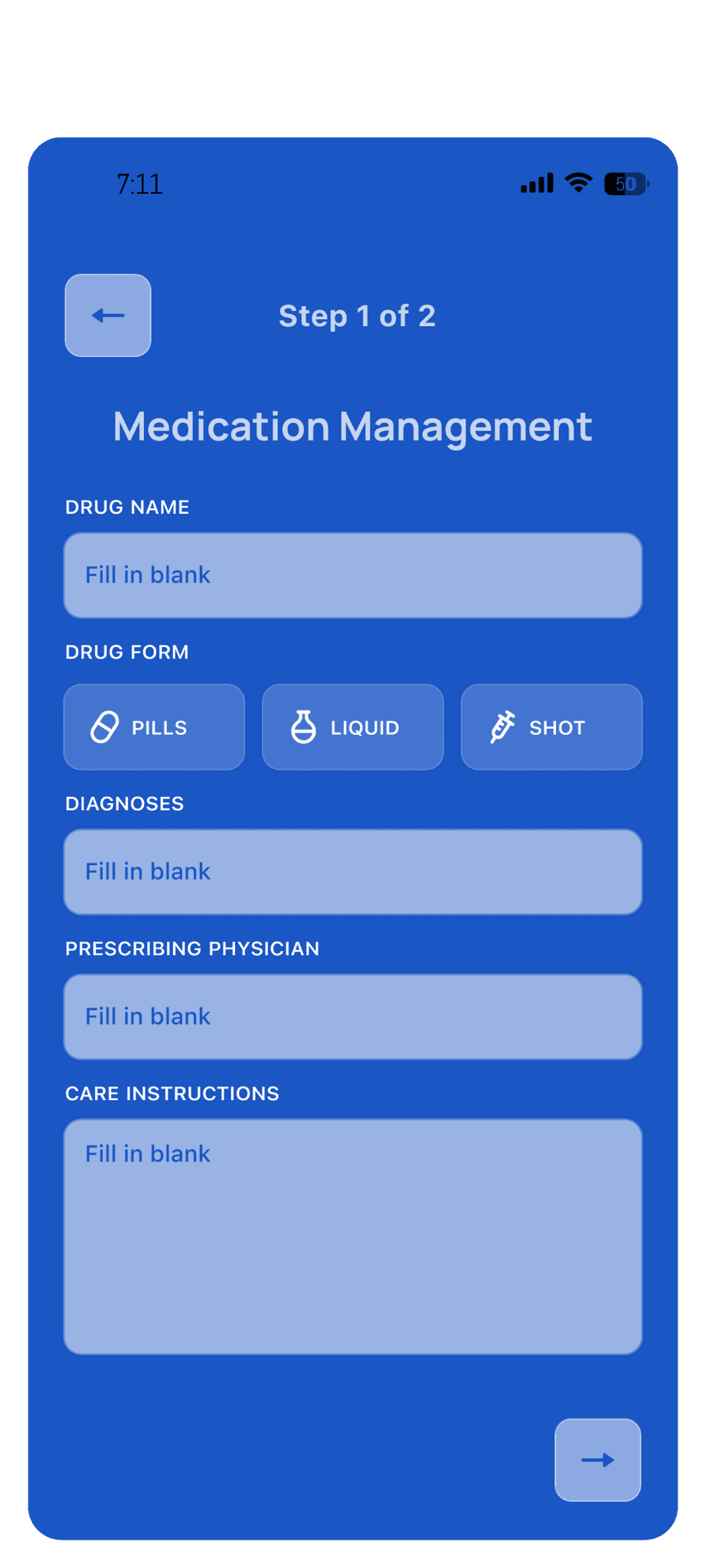
After taking into account the branding we've established, these are some of the final screens for the profile management user flow. The application's primary color is a blue given to us by our external clients. The color is utilized scarcely to emphasize the importance of information consumption. Components are styled like cards to correspond to the app's name, Care-Wallet.
After taking into account the branding we've established, these are some of the final screens for the profile management user flow. The application's primary color is a blue given to us by our external clients. The color is utilized scarcely to emphasize the importance of information consumption. Components are styled like cards to correspond to the app's name, Care-Wallet.
After taking into account the branding we've established, these are some of the final screens for the profile management user flow. The application's primary color is a blue given to us by our external clients. The color is utilized scarcely to emphasize the importance of information consumption. Components are styled like cards to correspond to the app's name, Care-Wallet.